Crafting a next gen visual experience to a legacy platform application for Ramco Systems

Overview

Overview

The platform being a legacy application serving them for more than thirteen years and the application is built with the help of automation code. The application involves high data entry and form field structure with few call to actions to guide the user.

Role

Role

UI Designer

Skills

Skills

Design Systems, Prototyping

Timeline

Timeline

6 Months - Launch

6 Months - Launch

Get in touch

Get in touch

Problem Statement

Problem Statement

The application is purely built on automation code depending on the mental model of the user with high learning curve. There was no clear information hierarchy or visual structure being used the application. The users wanted a more modern way of information representation with a clean interface.

The application is purely built on automation code depending on the mental model of the user with high learning curve. There was no clear information hierarchy or visual structure being used the application. The users wanted a more modern way of information representation with a clean interface.

Who are the users?

Who are the users?

Based on the initial user interviews with product owners, we identified key expectations and usage patterns that would guide our design direction:

Based on the initial user interviews with product owners, we identified key expectations and usage patterns that would guide our design direction:

Familiar Tools: Users were accustomed to enterprise tools like MS Excel, MS Teams, and MS Outlook — all of which rely heavily on manual data entry and dense interfaces.

Familiar Tools: Users were accustomed to enterprise tools like MS Excel, MS Teams, and MS Outlook — all of which rely heavily on manual data entry and dense interfaces.

Pain Points: The repetitive and rigid nature of these tools made workflows feel tedious and overwhelming.

Pain Points: The repetitive and rigid nature of these tools made workflows feel tedious and overwhelming.

Design Opportunity: There was a clear need for a more modern, refreshing interface — one that simplifies information input while offering a clean, user-friendly visual structure.

Design Opportunity: There was a clear need for a more modern, refreshing interface — one that simplifies information input while offering a clean, user-friendly visual structure.

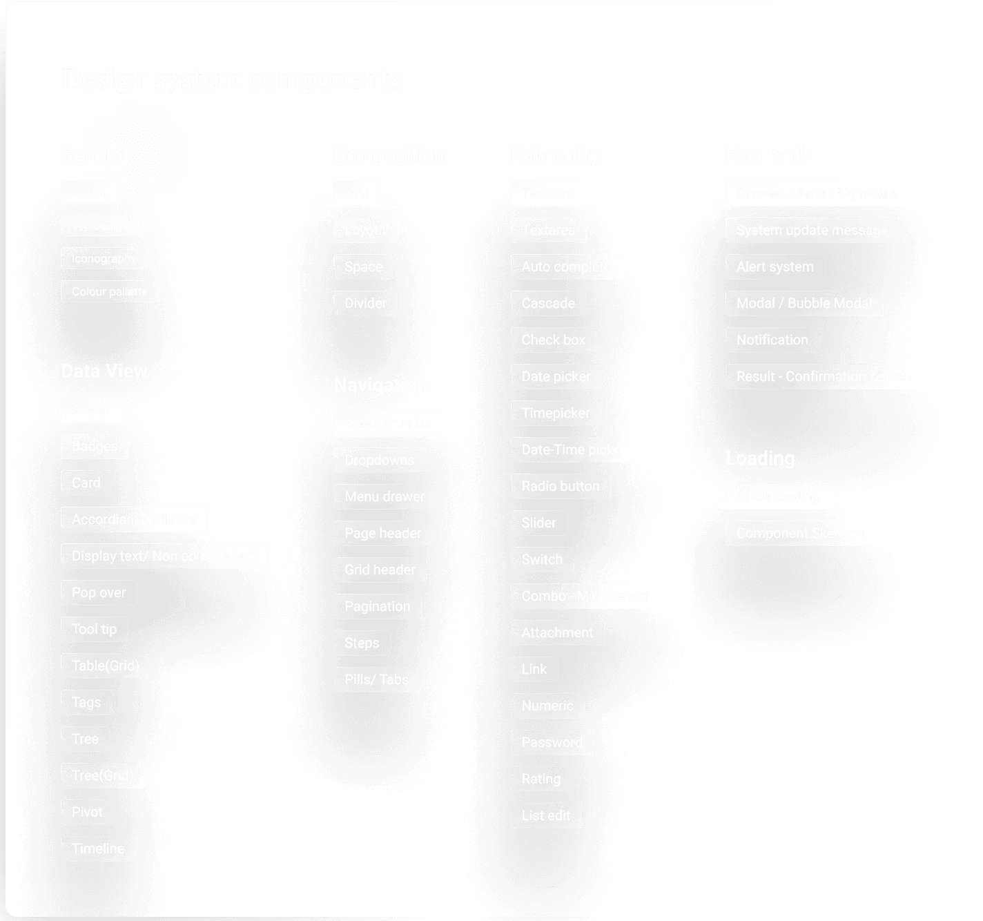
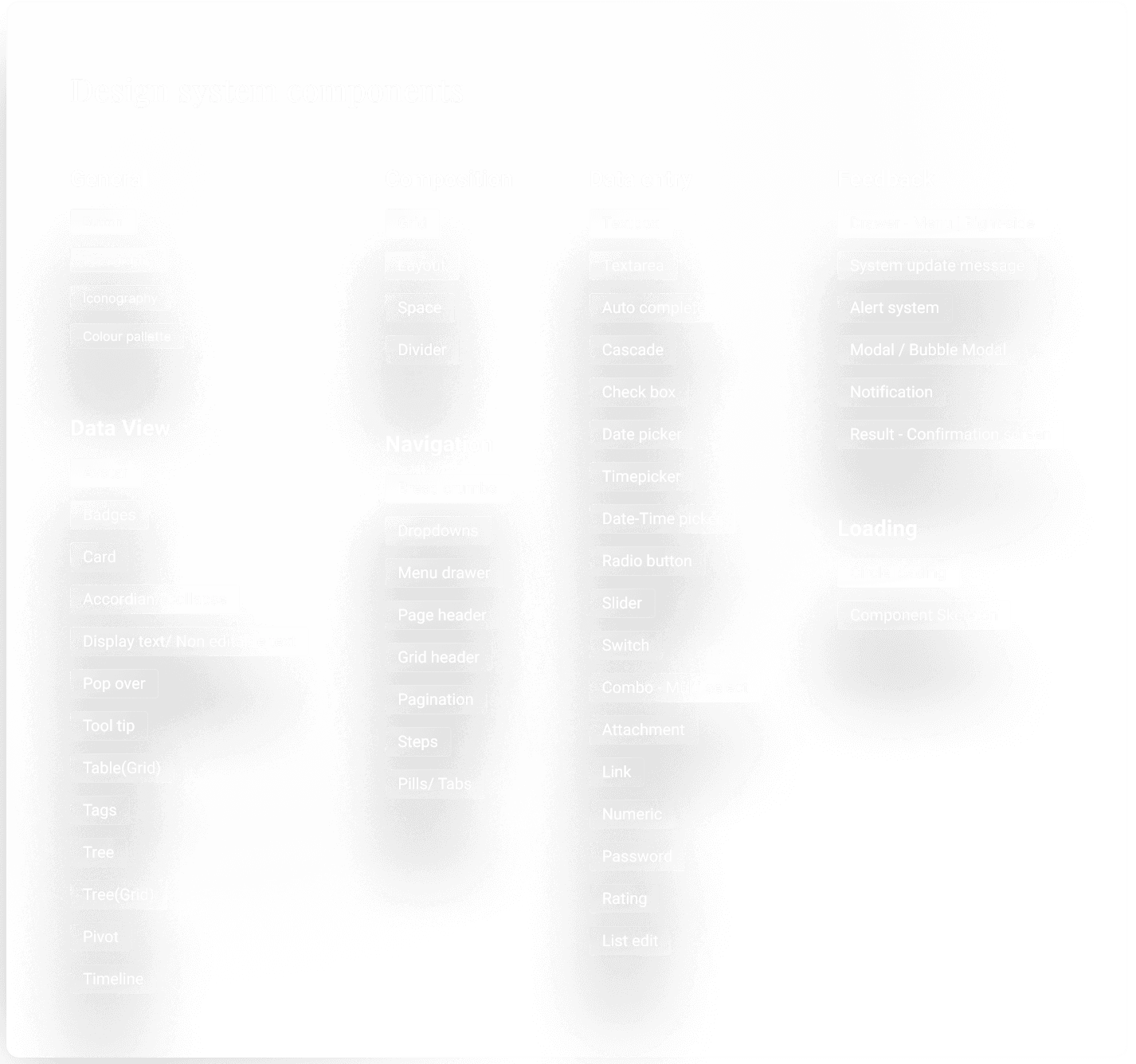
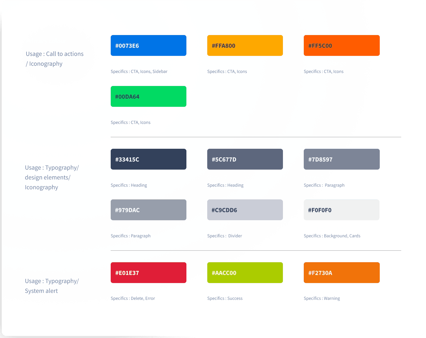
Introducing Design System

A Design System is a set of interconnected patterns and shared practices coherently organized. Design Systems aid in digital product design and development of products such as apps or websites.

The system can be broken down into different types based on the need of the product

Atomic

Molecular

Organism

Template

Building the Design System

Building the Design System

We choose atomic & molecular design systems as they act as an independent lego blocks which can be used and also provides us full control over the visual treatment of the platform we are building.

We choose atomic & molecular design systems as they act as an independent lego blocks which can be used and also provides us full control over the visual treatment of the platform we are building.

Atomic

Molecular

The first step of building a design system involves in creating a checklist of all the components that might be used in the platform.

The first step of building a design system involves in creating a checklist of all the components that might be used in the platform.

An Atomic-level component is the smallest component in the design system followed my Molecular-level component which can be used to create dynamic and scalable screen designs.

An Atomic-level component is the smallest component in the design system followed my Molecular-level component which can be used to create dynamic and scalable screen designs.

Atomic Components

Layout

Layout

A layout consists of three main components that allow users to recognise any design. Setting up layout in the first step helps us in creating wireframes for respective products.

A layout consists of three main components that allow users to recognise any design. Setting up layout in the first step helps us in creating wireframes for respective products.

This process helped the client to visualize their product and the outcome of how the design system would impact the visual layout.

This process helped the client to visualize their product and the outcome of how the design system would impact the visual layout.

Improved balance

Improved balance

Clear visibility

Clear visibility

Clean visuals

Clean visuals

Spacing

Spacing

We followed free-flowing 8 point grid system which provides us the freedom to align elements adjacent to each other in terms of eight pixels even on an atomic level. The spacing system gives the application a more balanced structure.

We followed free-flowing 8 point grid system which provides us the freedom to align elements adjacent to each other in terms of eight pixels even on an atomic level. The spacing system gives the application a more balanced structure.

Grid

Grid

We used Twelve column grid structure similar to Bootstrap with sixteen pixels gutter in coordinance with the eight point grid system we defined earlier for natural spacing between each components.

We used Twelve column grid structure similar to Bootstrap with sixteen pixels gutter in coordinance with the eight point grid system we defined earlier for natural spacing between each components.

Apart from above mentioned atomic components we have Typography, Iconography and Color palette which are used to form molecular components.

Apart from above mentioned atomic components we have Typography, Iconography and Color palette which are used to form molecular components.

Typography

Typography

We wanted to go for an open-source typeface that provides premium look and feel to the application, here information is weighed more than the aesthetic preference.

We wanted to go for an open-source typeface that provides premium look and feel to the application, here information is weighed more than the aesthetic preference.

By using Modular Scale, we were able to structure the respective heading tags and other font sizes that are required based on the needs of the application.

By using Modular Scale, we were able to structure the respective heading tags and other font sizes that are required based on the needs of the application.

Color Palette

Color Palette

The brand wanted to create a fresh look to the application although they have primary brand colors which were outdated and old compared to the new visual style we were building.

The brand wanted to create a fresh look to the application although they have primary brand colors which were outdated and old compared to the new visual style we were building.

A total of Forty-eight different colors were introduced for various purposes and each color defined for specific purpose.

A total of Forty-eight different colors were introduced for various purposes and each color defined for specific purpose.

Molecular Components

Molecular Components

Molecular components are created with several combinations of atomic components that we defined earlier. These components can also be considered atomic level based on how small it is compared to a large molecular component.

Buttons

Buttons

A button is an action element that allows a user to decide at a crucial point of the navigation or a flow. The color contrast of the button follows WCAG guidelines for accessibility to support users with different accessibility issues.

Textbox

Textbox

Textboxes are the most essential components when it comes to data entry and forms, the component is composed of Text Area, Title label, Underline caption, Iconography

Large Input label

Input caption message

Input Label

Input Label

8px

8px

8px

The spacing between the elements is measured at 8px in order to create a uniform structure with respect to free flowing eight point grid system.

Large Input label

Input caption message

Input Label

Default State

Large Input label

Input caption message

Input Label

Active State

Large Input label

Input caption message

Input Label

Error State

Visual Design

Visual Design

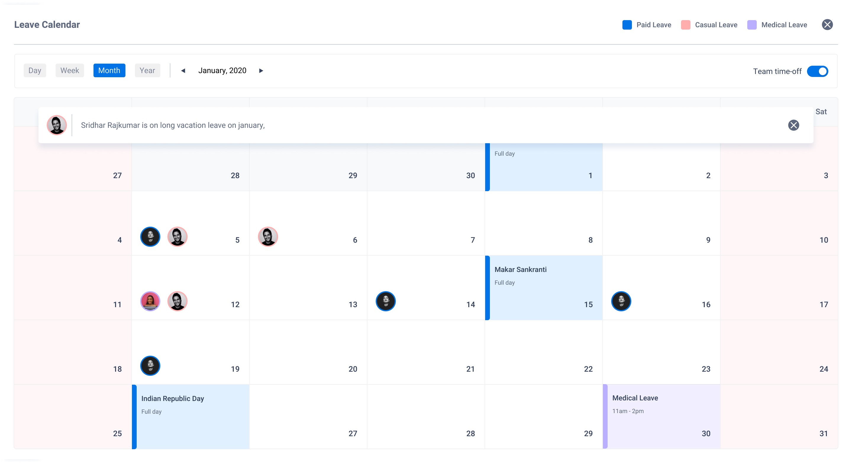
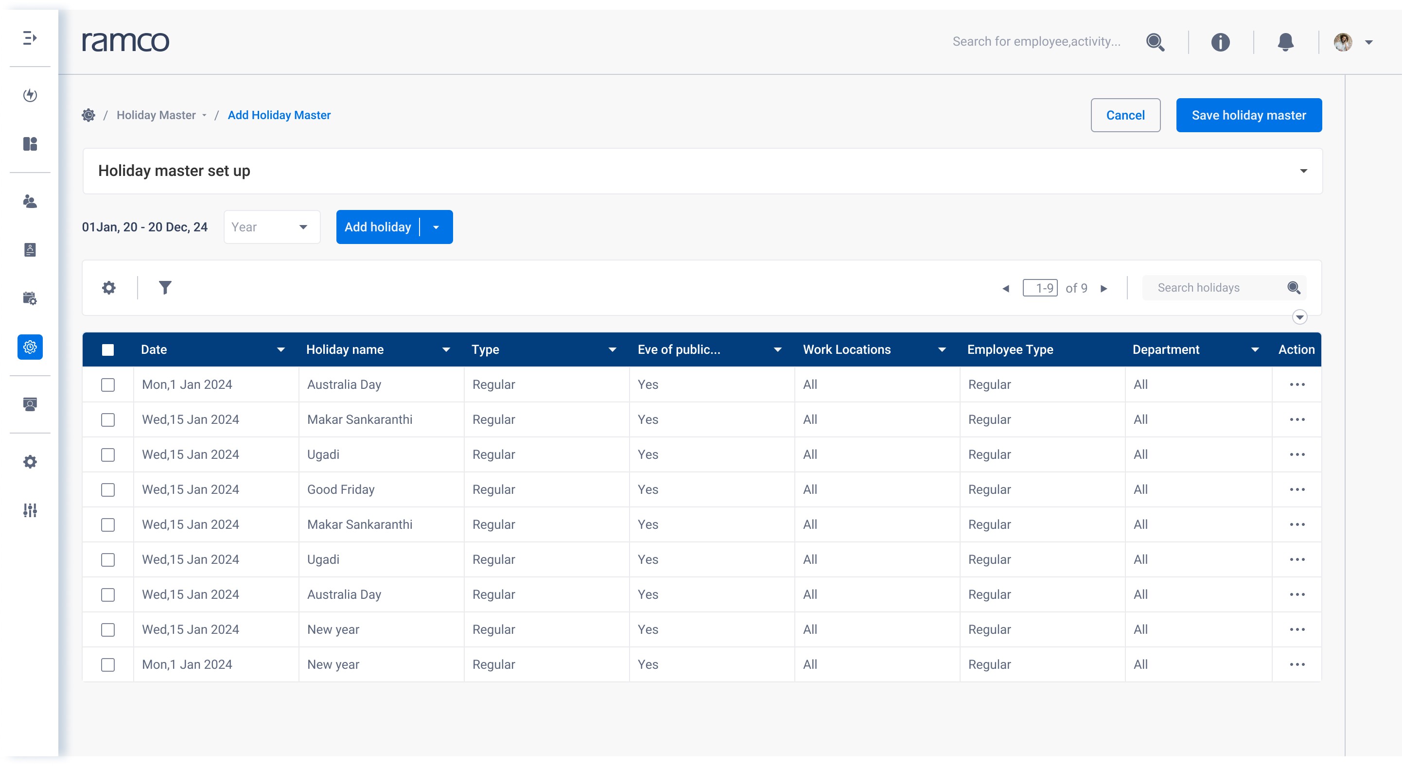
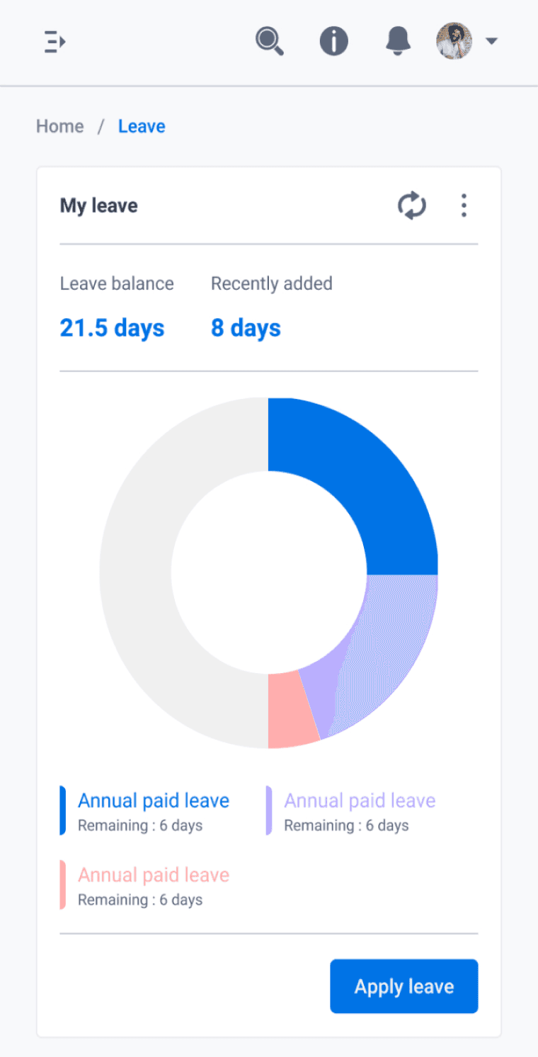
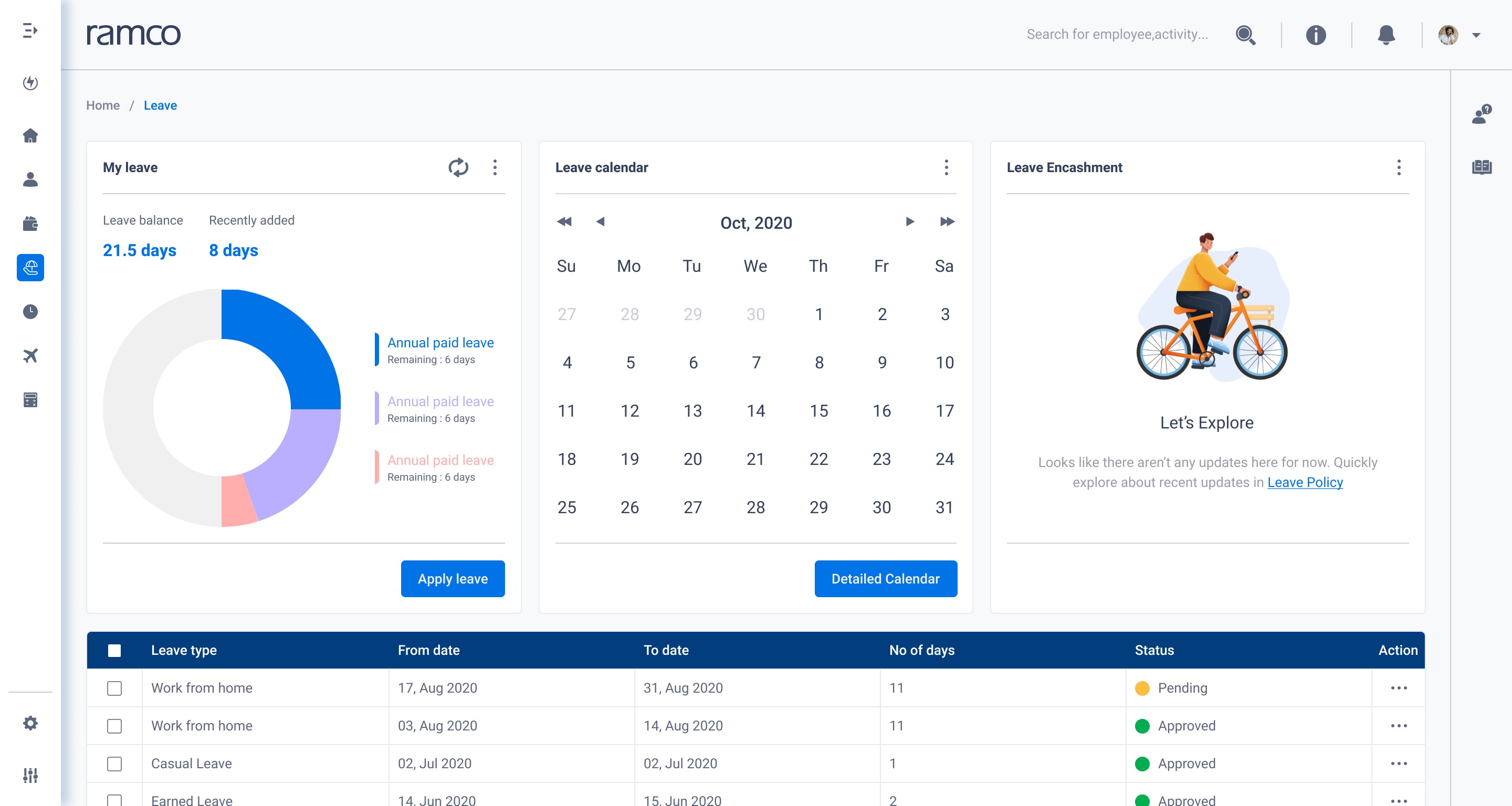
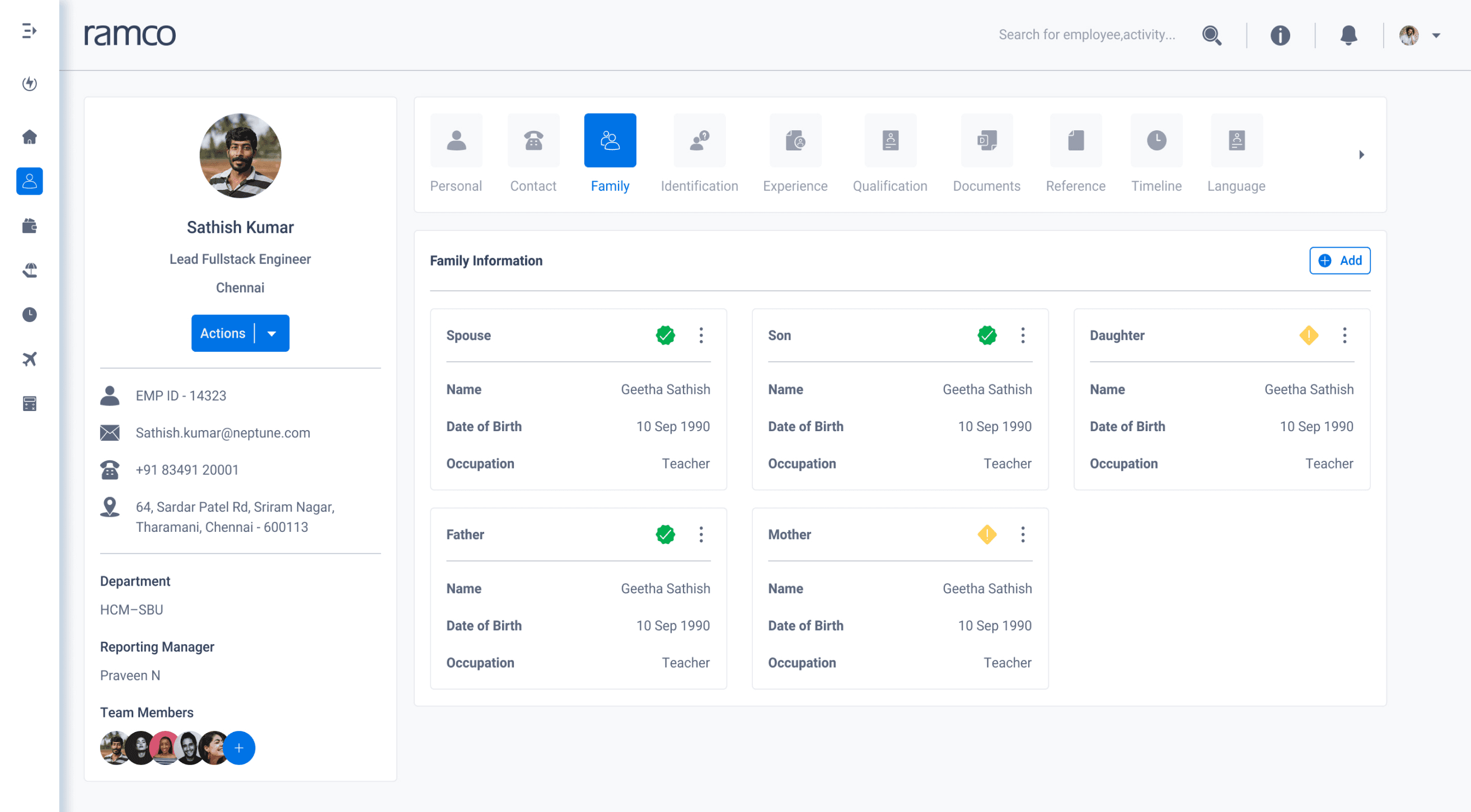
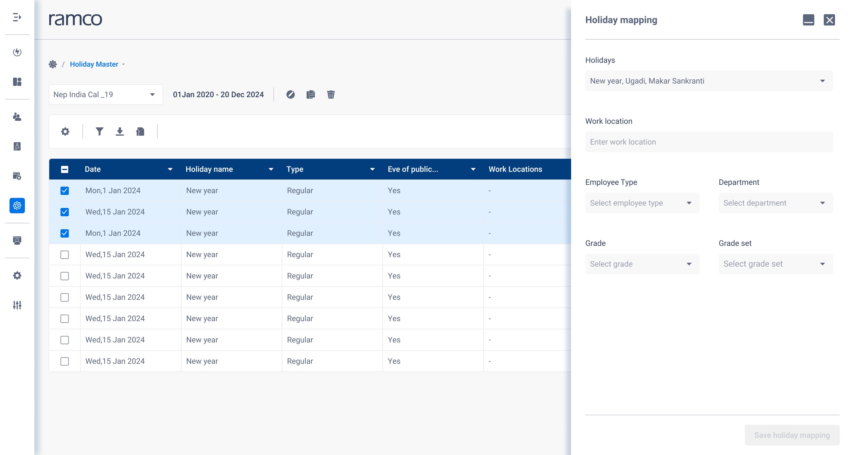
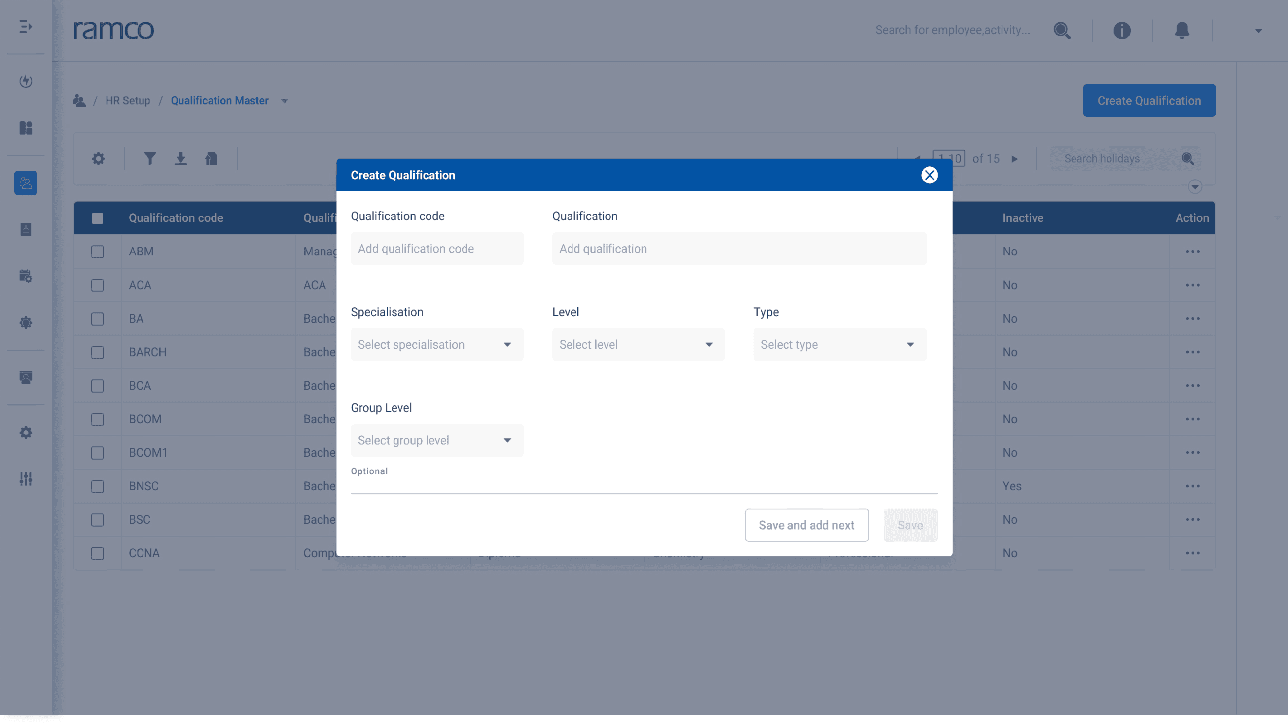
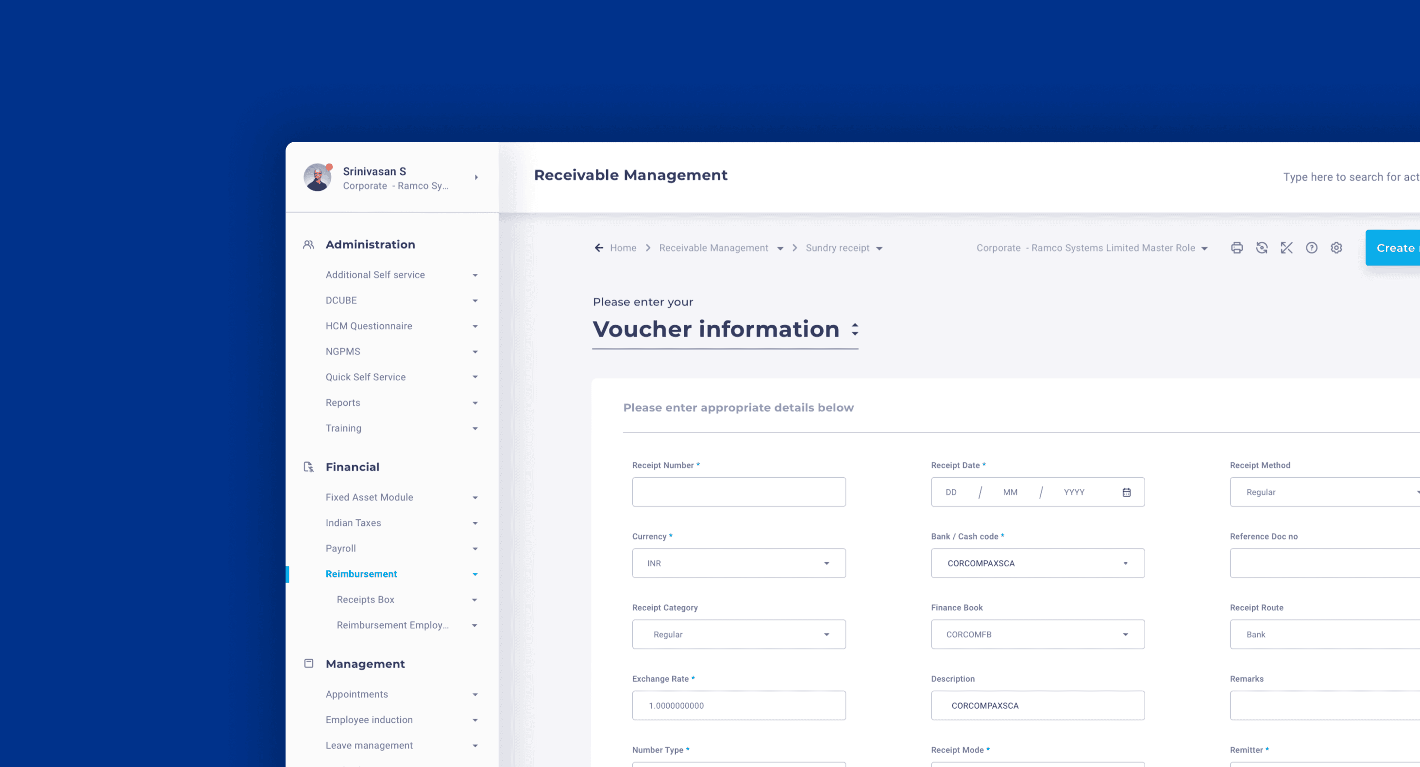
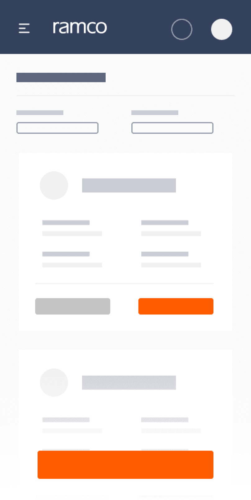
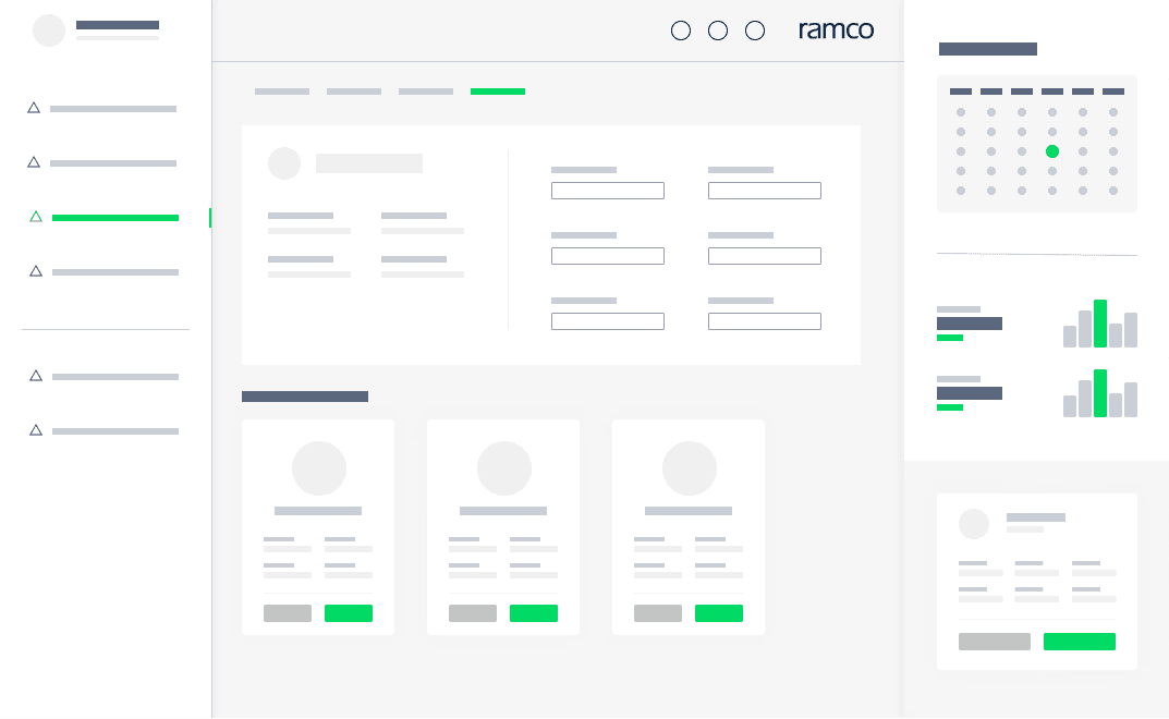
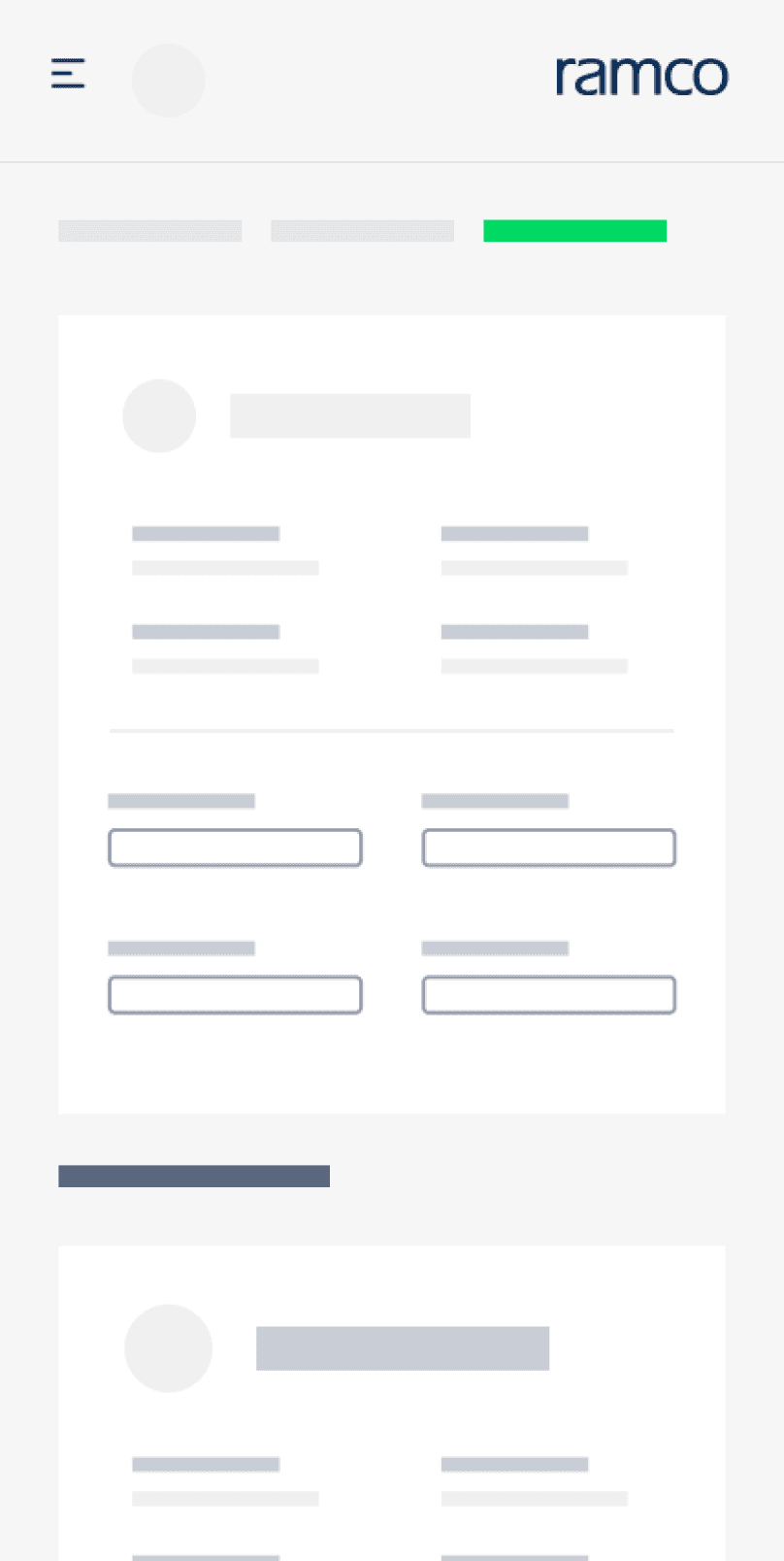
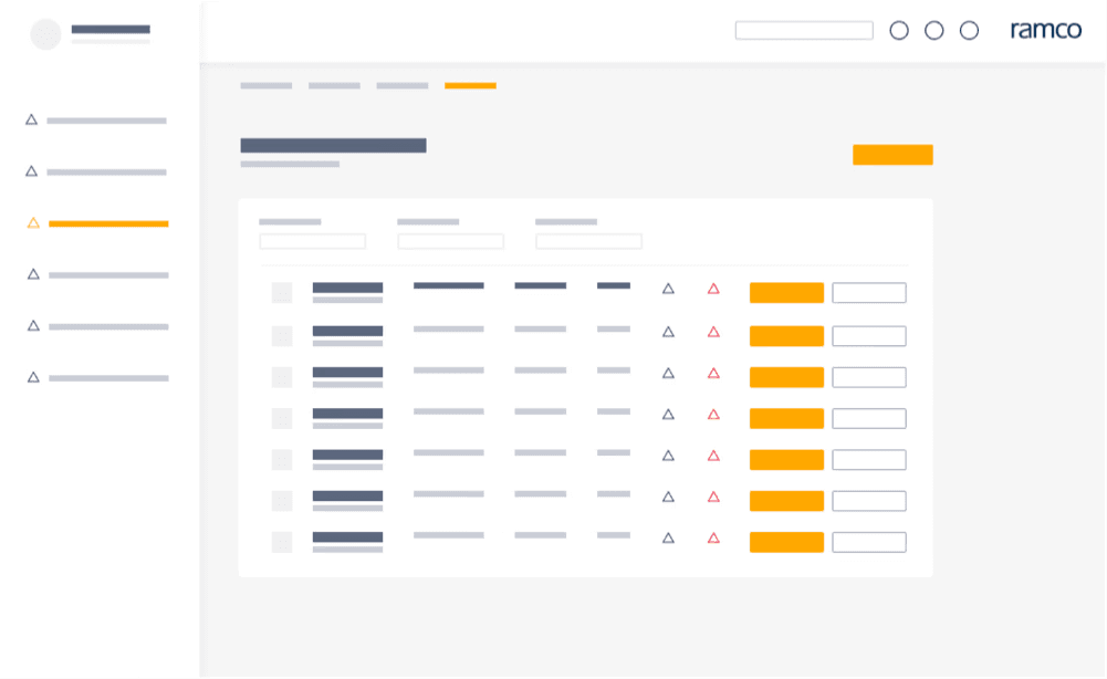
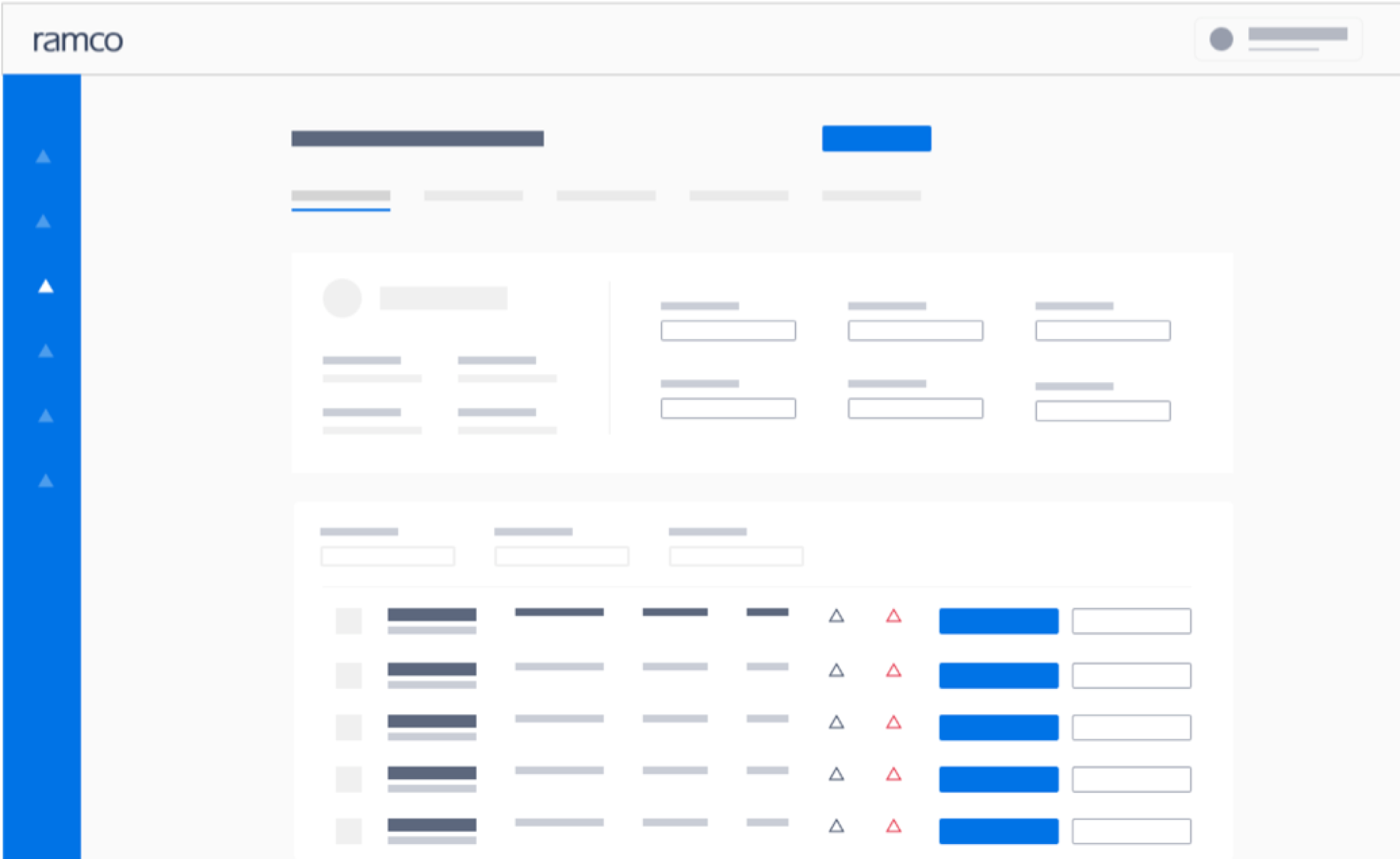
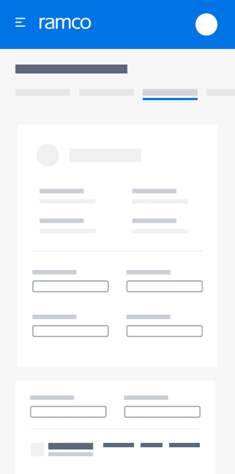
Building Visual Clarity through Design Systems

The design system was developed to create clean, modern forms that enhance visual clarity and reduce content overload. By prioritizing visual language and legibility, we aimed to improve user comprehension. Good visual design goes beyond aesthetics; it creates strong first impressions in a tech-driven world. With this system, we translated user needs into beautifully aligned and aesthetic interfaces.

What I have learnt

What I have learnt

I got a clear idea how a design system is very important and an intergral part of any product and how it could impact the scalability and visual design of the platform in the future.

I got a clear idea how a design system is very important and an intergral part of any product and how it could impact the scalability and visual design of the platform in the future.

Reuseablity

Reuseablity

Scalability

Scalability

Consistency

Consistency

Accessibility

Accessibility